So for those of you who would like to join me in putting collages into the world, here is an introduction to the craft, based on my two-years' experience in service of this blog:
First-off, there are 3 basic approaches which I have found myself using to create collages.
All 3 use the basic steps of (A) having an idea/experience/emotion that you want to share; (B) gathering images that, in combination, will convey said inner-state; and (C) blending those images together to achieve that evocative visual representation.
But within that generic frame, the strategy of each approach is slightly different.
1: HAVE IMAGE IDEA, FIND PARTS
For instance, in "Fickle the pickle," I knew what image I wanted (a girl bleeding over a sandwich), and so I found parts that I could build up to create that picture (little girl, lettuce, bread, pickles, "meat," tiled diner floor, etc.).
.gif)
2: CHOOSE MEANINGFUL PARTS, MAKE INTO IMAGE
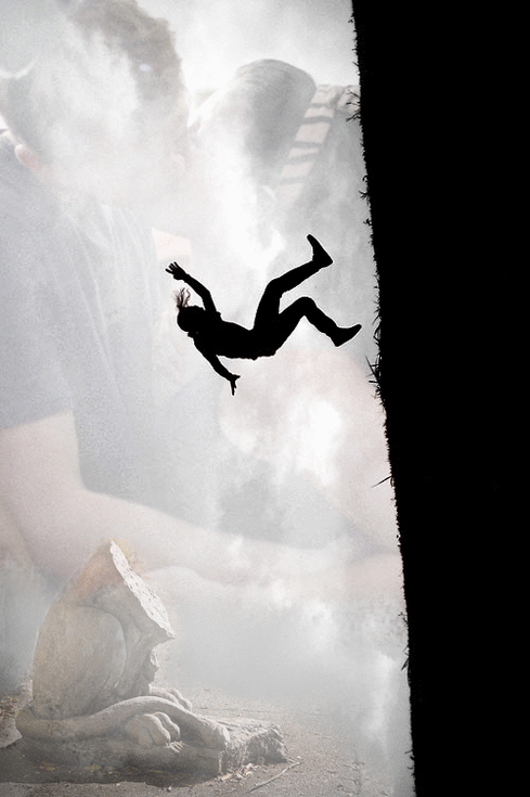
When I made the collage for "Trickle-down," I had no pre-set composition, but just a collection of images (headless girl on bed, open head, blood-red flower, men & planes plummeting, etc.) which I shifted and sorted around until they cohered well.

3: TAKE STRONG IMAGE, FILL IT IN (like a bowl)
For the collage of "Safe enough," I knew the image that I wanted to make central, so I cropped it aesthetically and then went about texturing/coloring/complicating it with other enriching images (fire, glass beads, excavation site, trees, a dog rescuer, etc.)

_ _ _
No matter what approach (or
blend of approaches) you take,
there will be some basic steps to the process of creating a cohesive collage:
Compose – for eye-flow
(note how the elements in “Undersides” are placed to draw your eye in a clockwise expanding wave around the page …)
(note how the elements in “Undersides” are placed to draw your eye in a clockwise expanding wave around the page …)

Build and Adjust – for
texture and interconnection
(note how the pill-shaped elements in “Vitamins” draw a line of connection from the man to the woman, and texture his muscles, and how the white ingredients-list beside the man compliments the white health-info beside the woman …)
(note how the pill-shaped elements in “Vitamins” draw a line of connection from the man to the woman, and texture his muscles, and how the white ingredients-list beside the man compliments the white health-info beside the woman …)

Layer, like watercolor –
for light and depth
(in “Camel,” I layered the center-image several times over, blending each with the last until it was prominent at it center – yet integrated at its edges. You can see the same multi-pass staining happen with the dark image at bottom center, of a nephew's hand on an uncle's arm …)
(in “Camel,” I layered the center-image several times over, blending each with the last until it was prominent at it center – yet integrated at its edges. You can see the same multi-pass staining happen with the dark image at bottom center, of a nephew's hand on an uncle's arm …)

Fill and Blend – for
wholeness and subtlety, i.e., focus and no-distractions
(I revisited “Tiny-Brief” a year later because I was so irritated by the prominence of the falling man's and the hill's silhouettes overpowering the lovers' kiss above and the violent rocks below … so I filled in the man with a rusty can and cobbled rocks, the hill with an ocean wave and a toothless laughing baby. The result is much more balanced and so invites the eye to explore its subtle details …)
(I revisited “Tiny-Brief” a year later because I was so irritated by the prominence of the falling man's and the hill's silhouettes overpowering the lovers' kiss above and the violent rocks below … so I filled in the man with a rusty can and cobbled rocks, the hill with an ocean wave and a toothless laughing baby. The result is much more balanced and so invites the eye to explore its subtle details …)
So there's what I've learned about collaging, thus far, in a nutshell. Go make stuff!